You probably have a favorite color. Most people do: something they are consistently drawn to in stores, something that appears in their closet in three or four different versions. And that color, in the form they usually buy it, is often not the most flattering version of it on them.
This is not a niche problem. It is one of the most common gaps between what people wear and what works on them. The fix does not require buying anything new. It requires understanding your undertone: the quality of your skin that determines which version of every color will make you look lit from within, and which will make you look washed out.
What undertone actually means
Undertone is different from skin tone. Skin tone is your surface color: fair, medium, deep, and every shade between. Undertone is what lives beneath that surface, and it does not change with a tan or fade with age. It falls into three categories.
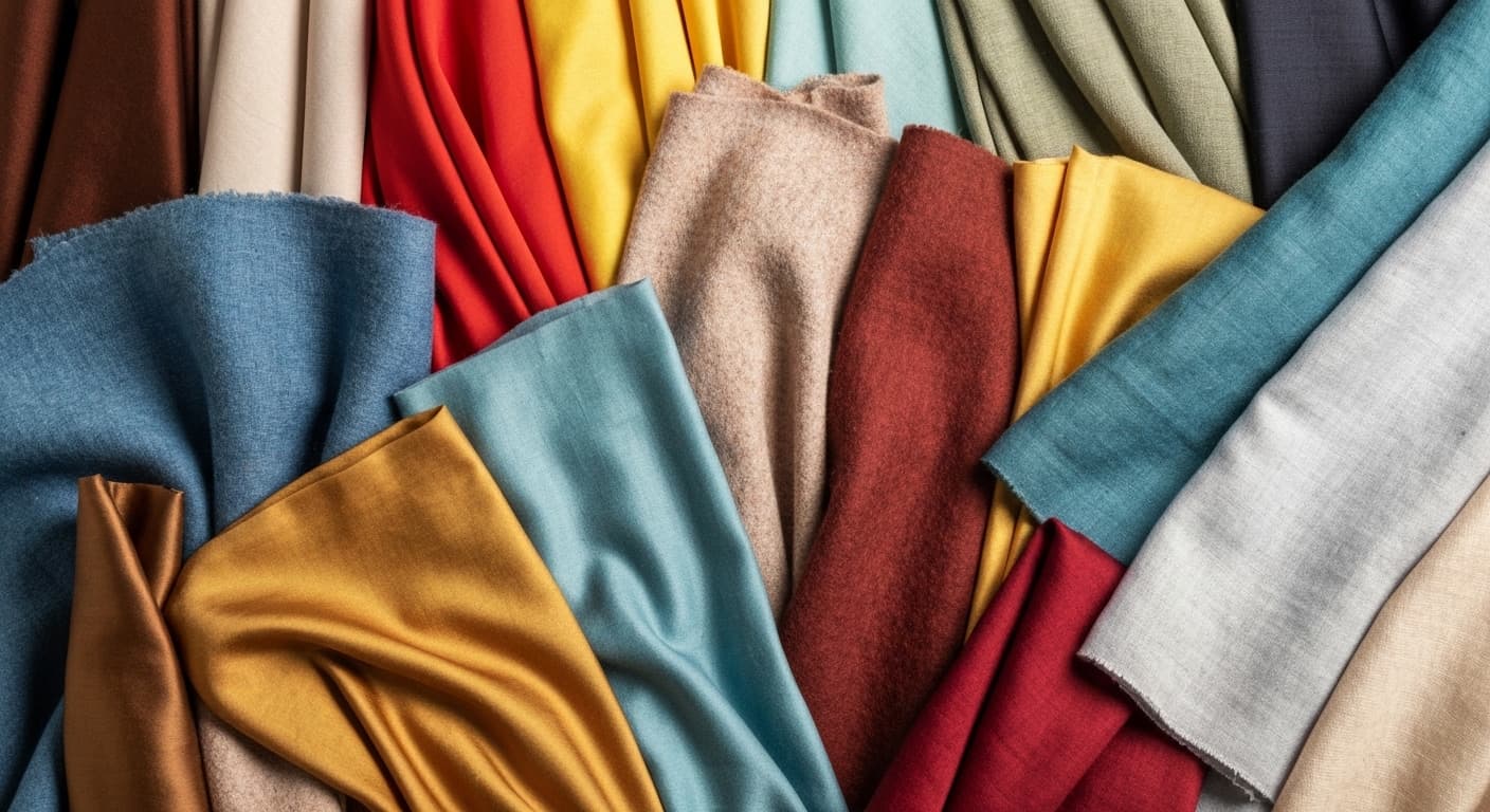
Warm undertones lean yellow, peach, or golden. The skin has a quality that reads as sun-touched even in winter. Warm undertones are flattered by colors with the same warmth underneath them: olive, rust, camel, terracotta, warm white (not bright white), chocolate brown, warm coral.
Cool undertones lean pink, red, or bluish. The skin has a clarity to it, sometimes almost porcelain. Cool undertones are flattered by colors with a cool base: true navy, dusty rose, slate grey, lavender, icy blue, burgundy, cool-toned nude.
Neutral undertones are balanced between warm and cool, which makes them the most versatile. A neutral undertone can pull from both families. The challenge is that it can make it harder to know where to anchor.
Three ways to read your own undertone
You do not need a professional for this. Three tests, each taking under two minutes, and the answer becomes clear.
The vein test. Look at the inside of your wrist in natural light, not overhead fluorescent, not warm lamp. If your veins appear blue or purple, your undertone leans cool. If they appear green or olive, your undertone leans warm. If you genuinely cannot tell, if both blue and green are present, you are likely neutral.
The jewelry test. Think about whether gold or silver jewelry tends to look better on you. Not which you prefer to wear: which actually flatters. Gold warms up warm undertones; silver enhances cool ones. If both look equally good, neutral again.
The white test. Hold a pure bright white fabric next to your face, then hold an off-white or warm ivory. One will make your skin look clearer; the other will make it look dull or yellowish. Bright white works better for cool undertones. Warm ivory works better for warm ones.
Take all three together. The pattern will point clearly in one direction.
The version of your favorite color that works
This is where the undertone reading becomes practical. Almost every color family comes in warm and cool versions, and the difference matters.
Red: a warm undertone is flattered by tomato red, brick red, or coral. A cool undertone is flattered by true red, cranberry, or raspberry. Wearing the wrong version of red is the most visible color mistake: it reads immediately even when the viewer cannot name why.
White: warm undertones look best in ivory, cream, or warm white. Cool undertones can carry crisp bright white. This is why some people look washed out in white shirts and have quietly assumed white simply does not work on them. It does. It is just the wrong white.
Blue: warm undertones are flattered by teal, periwinkle, or warmer navy. Cool undertones carry true cobalt, slate, or icy blue with ease.
Green: warm undertones suit olive, khaki, and warm sage. Cool undertones are better served by cool sage, mint, or emerald.
What this changes about how you shop and dress
Once you know your undertone, you stop evaluating colors in the abstract and start evaluating the specific version in front of you. Not “does this navy work on me?” but “does this warm navy or cool navy work on me?” The answer becomes much faster.
It also explains pieces in your closet that you love in theory but never actually reach for. The color is probably right for your taste but wrong for your undertone. And the pieces you always get complimented in: there is a real reason for that too.
The goal is not to limit your palette. It is to give you a precise enough eye that you always buy the right version, and that every color you wear does what you want it to do.